|
|
|
|
|
Tuesday, April 28, 2009
 Stuff
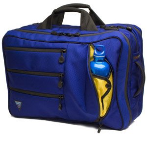
The Tri-Star: Check!

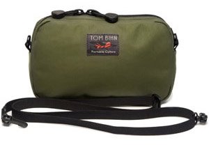
The Side Effect: Roger that!
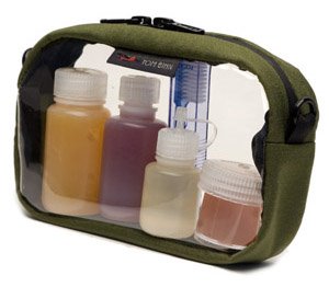
3D Clear Organizer Cube: Make mine in triplicates...

Of course there's more on their online catalog that I want such as the various pouch organizers and travel cubes, but those three mentioned above are on the immediate hit list. Damn you Tom! And stop smiling Darcy, you too!
Wednesday, April 01, 2009
How To Kill A Graphic Designer I'm sorry but could you also change on the site plan I sent you just now the color of the vacancy boxes to Bright Pink and have black bold lettering instead. Also put bold black lines around each box of each logo. If I need to do it and send you another copy let me know.
The picture looks good, very bright and clean. However, I do want the 'photo' and address to stand out more--the lettering is just too light. If you can make it bolder that would be better. The same for the spaces available for lease section, I don't think it needs to be as big as it is, maybe make it just a bit smaller but the white lettering definitely needs to stand out more. If there is no way to make the white bolder, maybe make the background coloring a little lighter. Also if you could change it to read Lease Space Available instead.
Next, completely cut out the floor plans and the come join these tenants because the new attachment has the site plan with it reading "come join our tenants" and the floor plans are now underneath the site plan with a line showing the vacancies from the site plan which makes them pop. Now if we are going over two pages when printed with the floor plans, either make the floor plans smaller to fit or possibly move the contact information underneath the Lease Space Available section.
I think that should do it and it will look good. This was taken verbatim from the client's job notes, I kid you not. And as comical as it sounds, these are the kind of things that can literally bring a designer to the brink of a meltdown. Also, this eerily reminds me of something I came across awhile back: 10 things a web designer would never tell you.
|
|
|